
This post has been long pending… While working on a company’s corporate branding, wherein there were huge debates around the typefaces and colours, I wondered what are the most common colours and font’s used in corporate logos. And luckily I found totaldesign.nl site (can’t find the sub link now) which had compiled 697 corporate logos and stated that the data/site site may be downloaded for research purposes or personal use. So, I promptly did a wget of the html pages to analyse later.
And here is a quick look at that database….
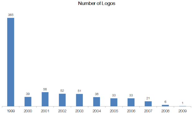
1) Number of Logos in the database and the year they were created: 697
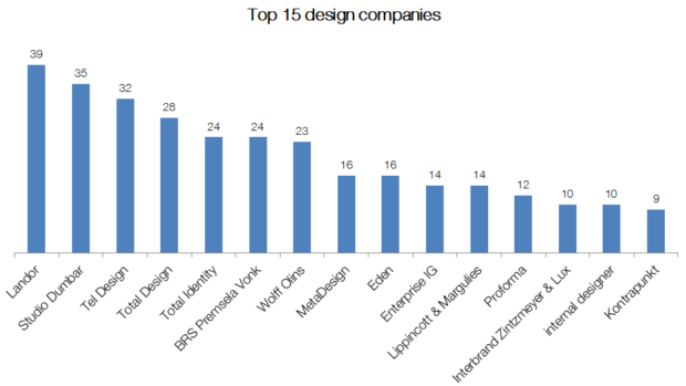
2) Top 15 companies which had created unique logos (not adapted / modified from previous)
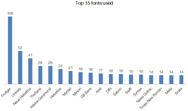
3) Top 15 typefaces used
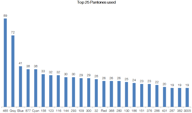
4) Top 25 colours (pantone) used
Will look at a few unique logos as well as quirks (preferences etc.,) of design agencies in the next post.